
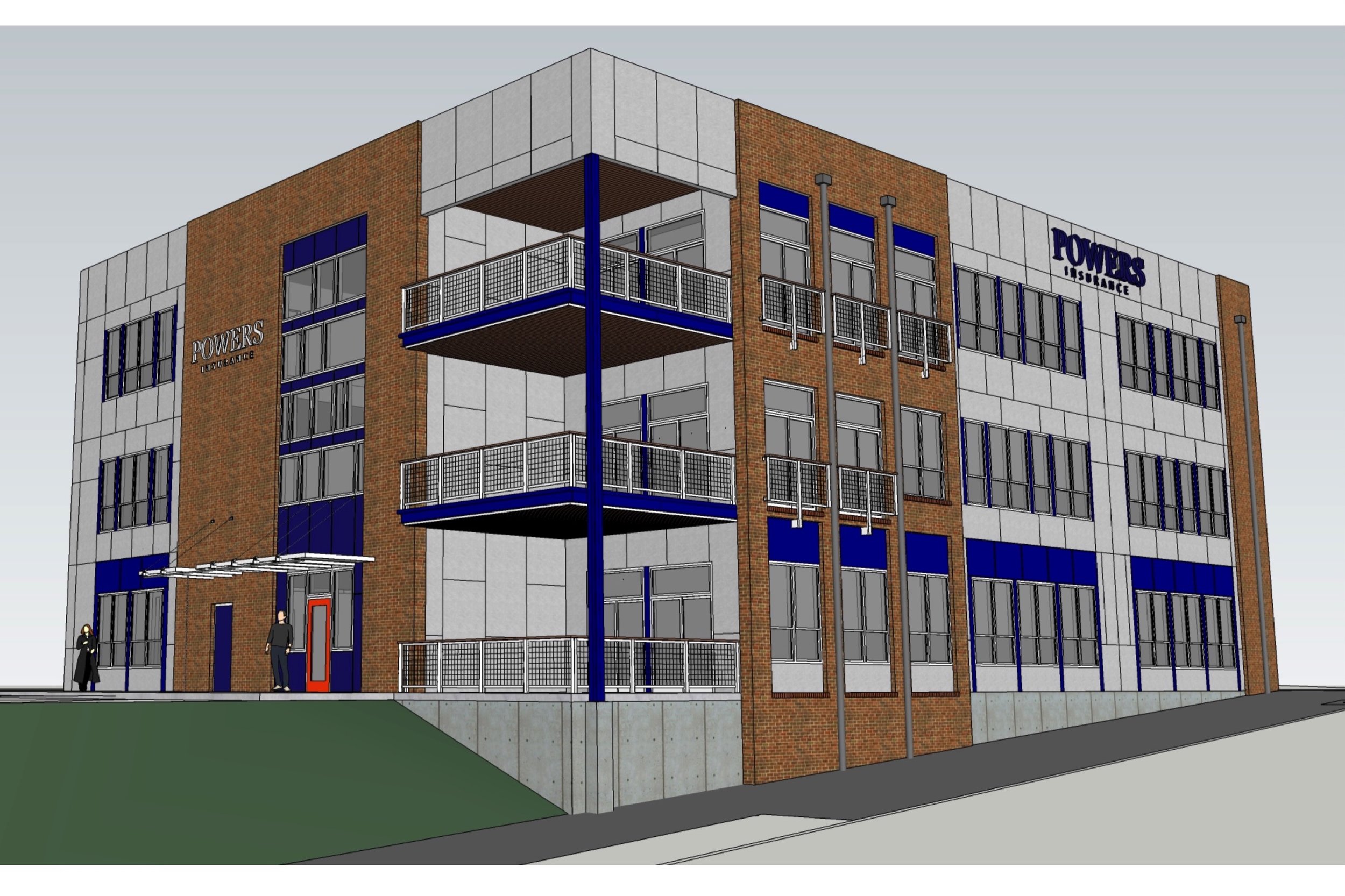
View From Northeast

The owners of the existing office building on a premier site straddling the line between St. Louis city and St. Louis county was deemed economically obsolete due to excessive costs for renovation and the addition of more rentable space.
To bring the costs into alignment with an aggressively low budget, a new office building needed to be constructed with materials and methodologies normally associated with residential construction – wood framing, fiber cement siding, vinyl windows, and brick veneer not to exceed 30% of the exterior.
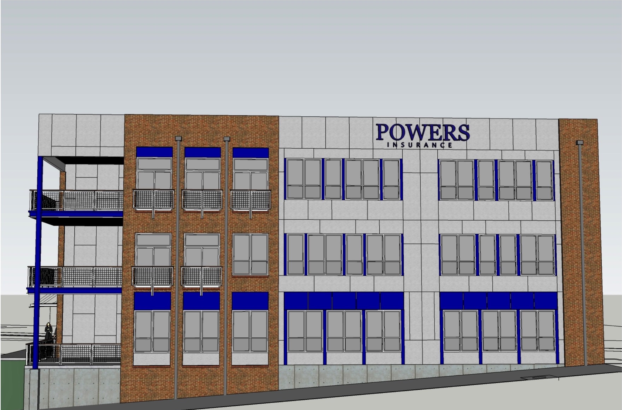
View From North

View From Northwest
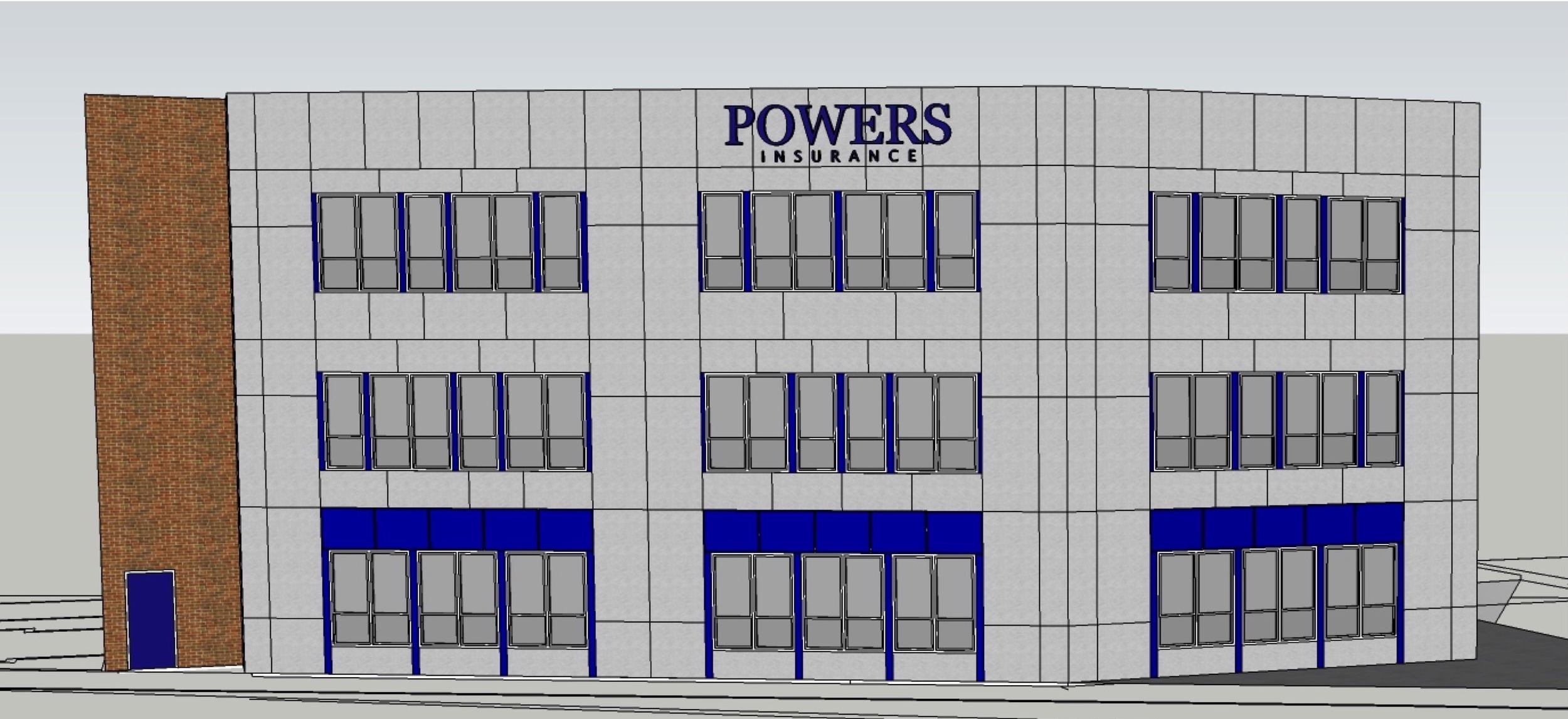
Comfort Architecture convinced the owners and builder that the approach to the design of the exterior of the building should not consist of assigning brick to the main level and siding to the upper levels, reasoning that with this approach anyone walking or driving by the building would have the same monotonous experience from wherever the building was observed.

View From West

View From East
Instead of using the brick to differentiate the main level from the upper levels, the brick was used in full-height limited locations interspersed between areas of siding, providing a viewer a series of experiences alternating between brick and siding.
View From Southwest
Because the wood-framed construction required shear walls at the corners of the building and at intermediate locations along the exterior walls, the locations available for windows was limited. Each location allowed a maximum of six windows in a row.
The non-uniform appearance achieved with the judicious use of brick and siding was continued with the use of windows either singly (1) or in pairs (2). Realizing that a group of six windows, either singly or in pairs could be arranged in five different ways (2-2-2, 1-2-1-2, 2-1-2-1, 2-1-1-2, or 1-2-2-1) and that each stack of windows would have three rows, one for each of the three levels of the building, the possible combination of groups for each stack was fifteen.
The 2-2-2 group of windows was reserved for the main level. The uniformity of this appearance along with the use of an accent color for the adjacent fiber cement panels created an arrangement reminiscent of storefront windows common in many urban areas. The arrangement of windows on the upper levels could have been any one of the four remaining groups or any combination of the groups. Comfort Architecture chose an arrangement where all the combinations were used, but no two adjacent groupings were the same, either horizontally or vertically. This arrangement was intended to complement and reinforce the non-uniform appearance established by the alternating use of brick and siding.

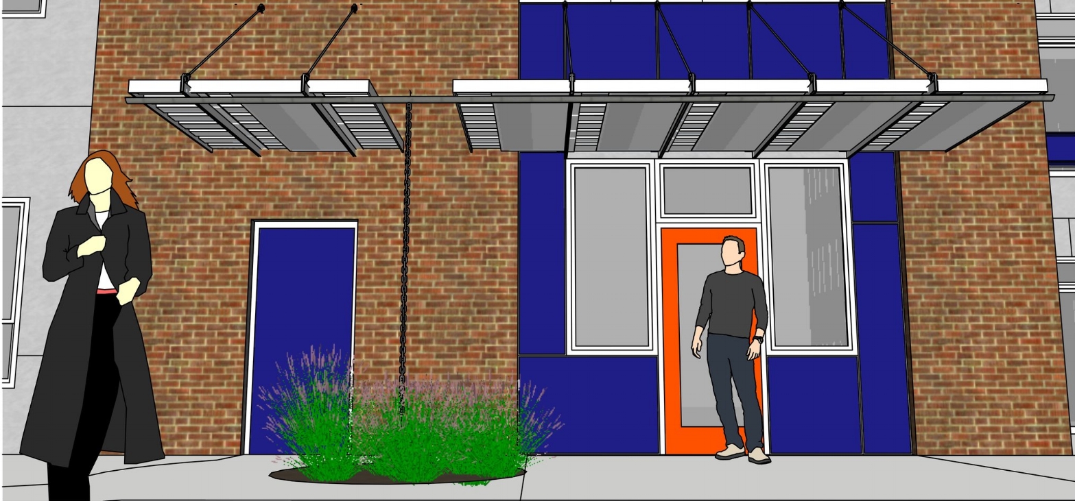
The concept of non-uniform arrangement of single or double window units within groups of windows was tweaked a little bit for the windows over the entry, shown at left. All of the windows are the same height, but the widths vary. The total width available for the windows was divided into eight “modules”. Each window is either, one, two, three, or four modules wide and arranged in rows so that none of the mullions between windows align vertically with the row of windows above or below.
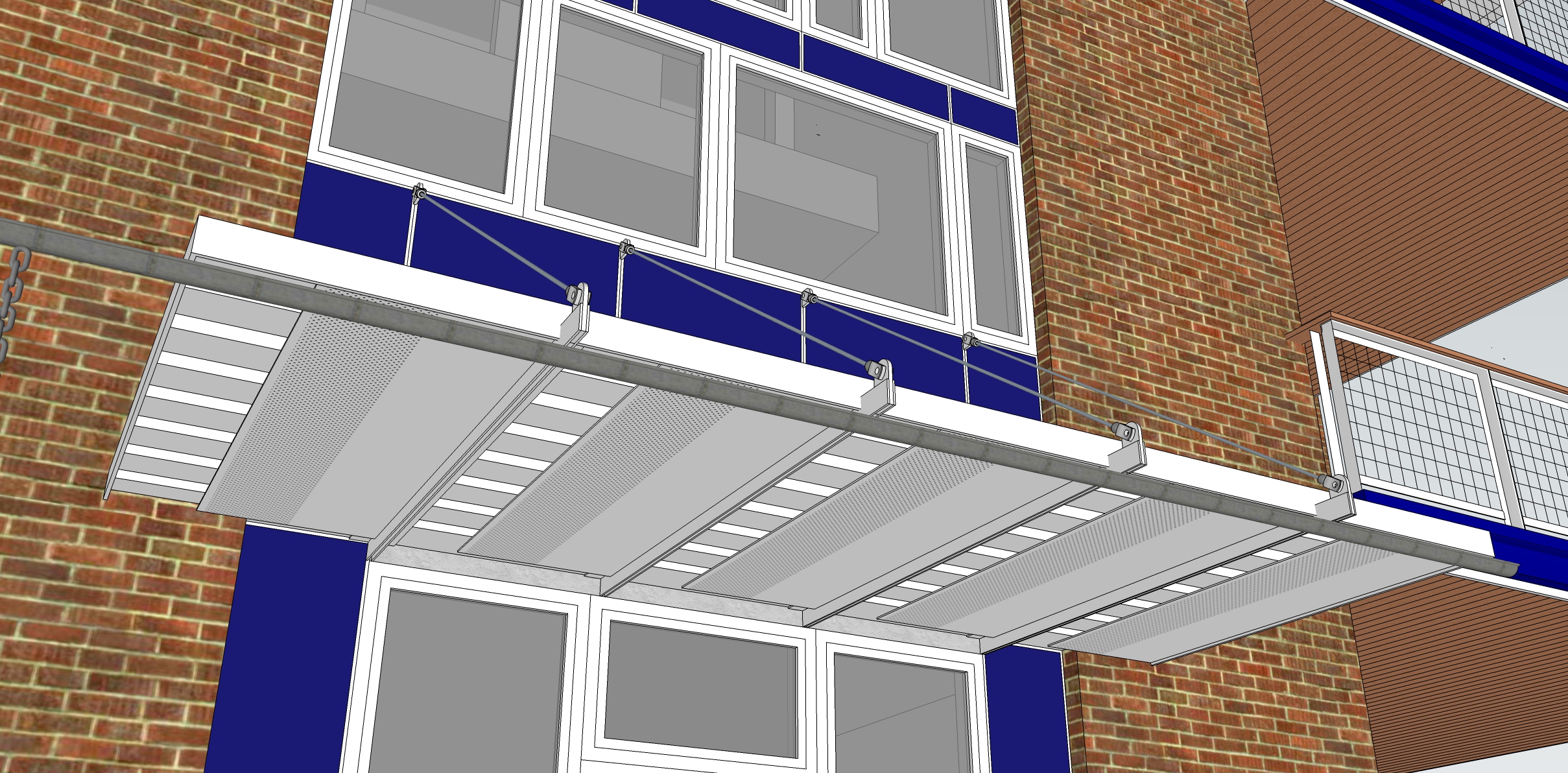
The entry canopies were inspired by two ideas… 1) Salvaging metal siding from the existing accessory building, and… 2) Incorporating the idea of three “panels” for the price of one that was developed for the conversion of the accessory building to covered parking. Both these ideas enable the entry canopy to serve as an appropriate transition between the covered parking and the main building. An interesting lighting effect will be achieved by installing LED strips behind the solid portions of the soffit panels so that the underside of the ribbed metal will be brightly lit and the holes in the perforation will become bright spots of light.
Rainwater is shed off the roof of the canopy to the front into a half-round gutter and down a rain chain between the two canopies to a small rain garden feature as shown below.
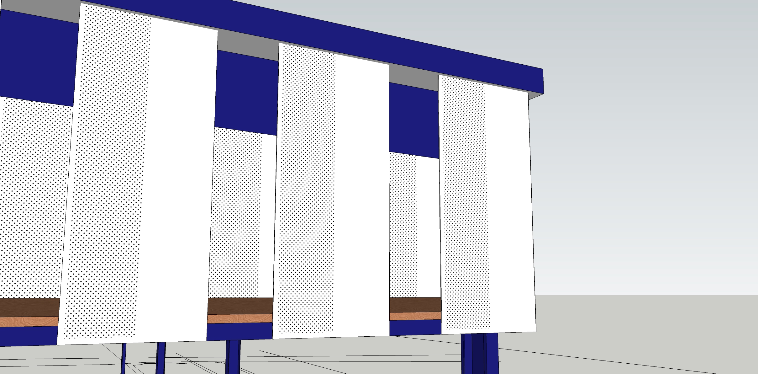
An existing accessory building will be converted into covered parking. After removal of the metal siding on the walls, the task was to come back with something to clad the top of the building above a line of intermediate horizontal framing members. The challenge was to make this interesting but cost-effective. Adhering to the adage that “Less is More” following is the rationale for the design shown here.
A suggestion was made to use the same fiber cement panels as those used on the main building. The drawback to this approach is that once you glanced at the building you would have seen everything there is to see. But there would be nothing at all to experience. Also, the experience from inside the garage would be the same as the outside… panel after panel after panel.
With the goal being be to make the building as interesting as possible, a slight modification was made to the panel idea.
Utilizing the vented soffit panel material shown on right, in the 2’ width, cutting it to length and installing it as a vertical panel, suddenly the panel has morphed into two “panels” with twice as much visual impact, for the same cost. Now there is a 1’ wide solid “panel” next to a 1’ wide perforated “panel”. Instead of installing the panels side by side (2’ on center) they will be installed 3’ on center. This provides two benefits… 1) Material costs are decreased by 1/3 and… 2) a third “panel” is introduced by the void – a negative “panel” to complement the other two positive “panels”. We now have the opportunity for three times the visual impact for one third the material cost… Less is More.
On top of this simple basic arrangement, the visual impact can be increased even more by introducing a 1’ offset to the layout of a row of panels on the outside from a row of panels on the inside. Now we have a solid panel in front of a void next to a perforated panel in front of a solid, next to a void in front of a perforated panel. Each of these arrangements has interesting implications regarding light and shadow.
All of this can be observed from a stationary vantage point either inside or outside the building. But by moving around the building this arrangement of panels enables the building to become something that can be “experienced”, not merely “seen”. Instead of a row of identical panels that offer only a single experience, the alternative arrangement of panels offers an interesting ever-changing dynamic opportunity for infinite experiences.